theteam@theeducationhub.org.nz
Postal Address
The Education Hub
110 Carlton Gore Road,
Newmarket,
Auckland 1023

‘It worked! Data analysis made easy’ is an ongoing data-driven professional development initiative in the Gisborne Community of Learning (CoL). The key components of It worked! includeautomation of analysis, teacher-friendly dashboards, collaborative workshops and data-coaching. Led by Darcy Fawcett, It worked! supports schools so that teachers can make better use of data to design, evaluate and share their teaching initiatives. This report focuses on the use of It worked! by 28 middle leaders in three secondary schools within the Gisborne Community of Learning during the 2019/2020 NCEA reporting cycle.
Since July 2018, working as a data-driven inquiry coach, I have supported three secondary schools in the Gisborne CoL to make better use of their data to design, implement and evaluate their teaching initiatives. In this report I describe the methods used in Term 1 of 2020 with three secondary schools and share feedback from participating middle leaders. This work focused on improving our use of data comparison, statistical analysis, and interpretation and use of data.
When comparing data sets, it is important to ensure high statistical validity. My colleagues sometimes evaluated their initiatives by comparing the assessment outcomes of one cohort who were part of the initiative to those of another cohort who were not. Generally, the comparison was cross-sectional (for example, the demographic groups in one year), but sometimes it was longitudinal (this year versus last year). This was a good starting point, and I supported these efforts by developing historical records of achievement to increase the number of students included in these comparisons. This increased statistical validity by providing a more representative population for the control group. We now mostly compare the latest year against the historical record (for example, 2012-2018), but sometimes each cohort includes multiple years. The longitudinal records were constructed by extracting data from student management systems (SMS) or by accessing data direct from NZQA.
Prior to the introduction of It worked!, my colleagues were already analysing their assessment outcomes, some were disaggregating their data, and a few were evaluating initiatives by comparing data from year to year. I helped them improve their evaluations by coding the statistical analysis and thereby providing them with appropriate research-level graphical and statistical comparisons.
Some teachers were using graphs produced by SMS, which sometimes compare the achievement of demographic subgroups, but none I am aware of produced graphs to compare cohorts over time. To better compare the cohorts, I provided colleagues with line graphs that display averages, and bar graphs, histograms and population pyramids that compare distributions. I coached colleagues to focus on trends over time and the relative skewof distributions. Most of the middle leaders I worked with are now confident in interpreting line graphs, bar charts, histograms, and population pyramids.
Some teachers were also using averages and percentages to compare cohorts. However, educational data are so complex that only research-level statistics will provide a basis for the valid interpretation of data. I supported my colleagues by providing research-level statistical tests, hence increasing the validity of their evaluations and inquiry.Most middle leaders now say they are confident in their ability to independently interpret the tests for statistical difference and strength of association for grade, endorsement and credit distributions.
To analyse all our community’s data in a timely manner, I have had to learn how to code the required research-level analysis in SAS. Coding and automating the entire analysis and reporting is essential as it is not feasible to use manual methods when supporting an entire community. I use SAS because it is a standard research-level data analysis programme and SAS provides it free to university students and independent researchers.
In addition to having research-level statistics, teachers must be able to access, interpret, utilise and share the data easily in their practice. I have improved our interpretation and use of data and our sharing of findings by co-constructing within-school and across-community workshops, teacher-friendly dashboards, common user-friendly reporting structures, and in-school conferences. Coaching and responding to feedback was essential. In 2018 and 2019 each middle leader received a whole day of one-to-one support
In 2020 we were able to achieve a massive reduction in one-to-one support by co-constructing an interactive dashboards report in which SAS output files are fed into Microsoft Power BI dashboard report. I provided 39 hours of collaborative workshops: colleagues could access up to 12 hours and averaged 7 hours each. Most middle leaders found the workshops useful.
Each dashboard presents data, graphs and statistical test outcomes in a teacher-friendly manner that supports the interpretation and utilisation of research-level statistics. See Figure 1 below for the Course Endorsement dashboard which I use as an exemplar, or watch a video explaining the entire iterative NCEA Subject dashboard report. The structure of the dashboards, the variables and focus questions were all co-constructed with middle and upper leaders in an iterative cycle of formal and informal feedback. Most middle leaders feel the dashboard is useful for understanding student achievement, evaluating teaching/learning initiatives, and informing future actions.
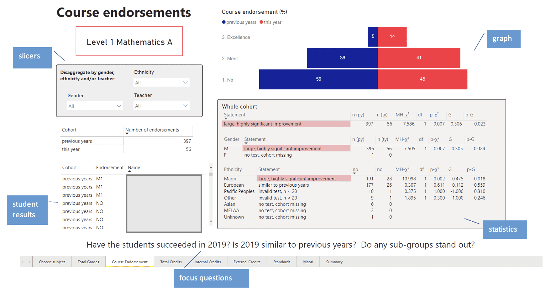
The Course Endorsement dashboard compares the course endorsements of the 2019 cohort with those gained in previous years (2012 – 2018). The statistics table presents the appropriate statistical test outcomes for the whole cohort and is also disaggregated by gender and ethnicity. As well as presenting the appropriate numerical statistics, a common-languagestatement for each statistical test is presented and highlighted when a significant relationship exists. Using common language statistical statements has led to a large, highly significant improvement in the confidence of middle leaders in their ability to interpret research level statistical data. The dashboards could also be exported to Powerpoint and used by middle leaders to report back to their schools on their NCEA analysis.
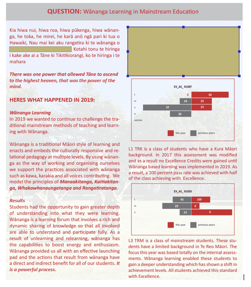
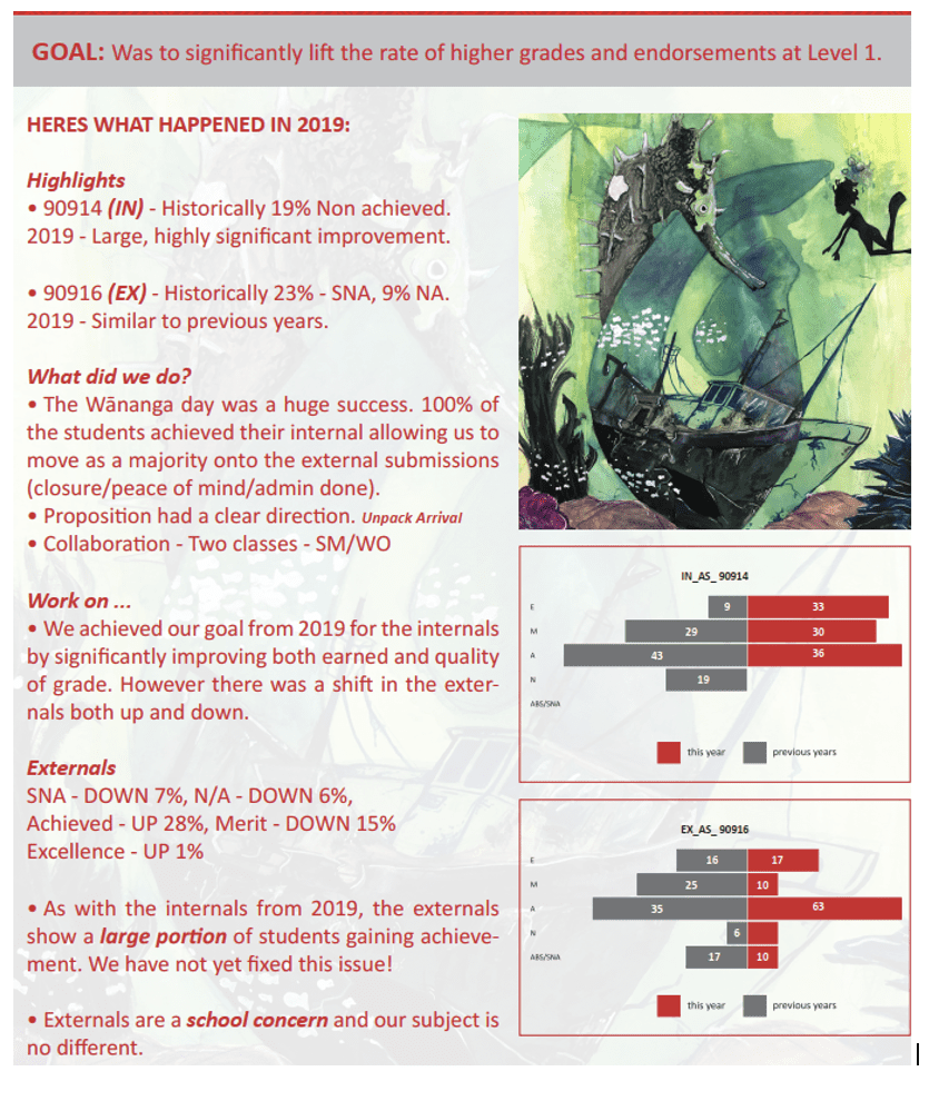
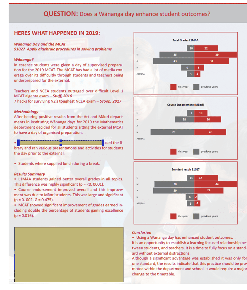
The middle leaders at two of the three schools had to present ‘successes and challenges’ to a whole-staff meeting. Most middle leaders found preparing their presentation useful in terms of clarifying and collating their findings and action plans. They also found the whole-school presentations beneficial for sharing their challenges, goals and plans with their colleagues, and for understanding the challenges, goals and plans of other departments. For example, at the 2019 conference of one school, the middle leader of the Māori department explained that he was introducing wānanga in a drive to lift performance in Te Reo Māori (see Figure 2). Wānanga are a traditional Māori approach to learning in which students and teachers collaborate for an extended period to reach a defined learning goal. Several other leaders were excited by this idea and introduced their own wānanga initiatives. At the school’s 2020 conference, the middle leaders of Art and Mathematics proudly reported that their wānanga initiatives had produced significant improvements in outcomes (see Figures 3 & 4). These presentations had such an impact that one school trialled wānanga with every NCEA class.
Middle leaders of all three schools feel It worked! is developing evidence-based practices in our CoL. Since our collaboration, the majority of middle leaders feel confident in using NCEA data to inform and evaluate practice in their area of responsibility, rate their practice as evidence-based, and are confident that their evidence-based initiatives will lead to improvement. They are keen to engage in It worked! again, and would recommend it to colleagues at other schools.
Key lessons from It worked! 2018 – 2020
Research-level analysis is within the reach of all. With support, all teachers and leaders can interpret research-level statistics and apply the knowledge they develop in their practice.
Data coaches able to use research-level methods and lead inquiry are essential. Data coaches support their colleagues to understand, interpret and apply research methods to their shared context, co-construct dashboards and support structures that suit their needs, and work through the entire data-driven inquiry process.
Teacher-friendly dashboards are essential. Most teachers and leaders do not have the knowledge, time or the inclination to engage with standard research-level statistical outputs. Dashboards allow users to understand and use research-level statistics in sophisticated ways.
In-school and across-community workshops are essential. Middle leaders find in-school and across-community workshops useful and valuable for analysing their data, sharing successes and challenges, evaluating and planning initiatives, writing reports and preparing presentations.
Conferences share best practice. Middle leaders find presentations and conferences useful and valuable for clarifying their ideas and for sharing best practices. As a culture of inquiry develops, middle leaders believe their presentations have a real impact on teaching and learning.
In the future, we plan to improve our current model of data-driven inquiry by conducting formal hypothesis testing into the causes of our ‘successes and challenges’ and monitoring the implementation of our initiatives using other data sources. These other data sources could include attendance, student voice, document review and classroom observations. We will also investigate online repositories of professional knowledge such as Visible Learning and What Works Clearinghouse to inform our initiatives. It worked! has succeeded in supporting three secondary schools in the Gisborne CoL to make better use of their data to design, implement and evaluate their teaching initiatives. There is evidence that It worked! is supporting a cascade of evidence-based practices that enhance student outcomes. It worked! is also being used in primary and intermediate schools in the Gisborne CoL, where dashboards analysing junior data and workshops are being introduced. With further support the It worked! model could be introduced and trialed in other communities across New Zealand.
Further reading
Fawcett, D. (2019). It worked! Supporting robust data analysis in a CoL. SET: Research Information for Teachers, 2, 53-58.